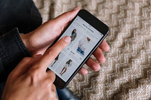
On every eCommerce, a well-designed website is an essential thing globally. At least especially for those whose purpose is to encourage visitors to the desired action. Of course, every seller has the primary goal of encouraging visitors to buy an item. They serve the primary purpose of why you have invested tens of thousands of euros in your webshop.
Learn more about the #advantages of a well-designed eCommerce #website. Take a look at this article and #improve your website easily.
Since, in the end, they have the task of bringing you tangible economic results – first return on investment, and then profit.
Usually, their design is the first place where you can recognize the level of expertise of your web developer. It is measured in a conversion rate that clearly shows how many of your visitors ultimately buy something. Here we come to two basic assumptions:
- People are primarily computer illiterate.
- People on a subconscious level function according to scientifically based rules.
Based on these basic assumptions, we can conclude next. The main idea is to adapt the design of these pages. It will be apparent to absolutely every visitor where everything is. And they will be able to intuitively conclude where they can click to get the desired thing.
While this may not seem complicated at first, we have to take into consideration many things. Essential details have to be tuned. Besides having the best store add-on for Elementor, we will highlight the leading 5 of them below. Let’s go in order.

1. The Website Must Be Intuitive
It is not the most crucial thing in the world. It is an essential thing in the whole space. If we want to see satisfied customers or visitors, we have to provide them with the answers to three questions:
- What is the primary purpose of the site?
- What is expected of him to do the following, and how?
- And what is the benefit for him from using that site?
We can quickly achieve this with intuitiveness and quality presentation of information. Your web should navigate and completely illiterate people. Otherwise, the website does not fulfill its purpose and is useless. Not to mention how you can throw the money you invested in its development to the wind. If your grandmother cannot handle the website, it means it is not good enough.
2. Reduce Navigation Options
Imagine you are shopping with your wife. After two hours of trying it on, she finally decides on a pair of shoes. However, when you drag her away from the register and show her the new shoes. Two more hours pass, and she ends up buying nothing. As you can conclude, the sales page should focus only on one pair of shoes (i.e., one product).
Also, the “big green arrows” should indicate the path to the checkout. Well, not literally. We just emphasize the importance of that element.
It means that if you have side navigation annoyances, be sure to remove them. Disturbances include advertisements, links to other discounts, links to other parts of the web, some banners, etc. Your product page may contain its name and image, description, icon “add to cart,” and a standard navigation bar. The one that is always visible at the top of the web.
Think of sales pages as a tunnel – there is a product at one end and a cash register at the other. The rest does not exist. However, when your customer completes the purchase, use some tactics and try to sell at least one more product. You can tell the customer something like people bought this jacket in addition to those shoes, etc.
3. Avoid Red Color on Interactive CTA Elements
Traffic lights do not accidentally use the color red when necessary to signal the driver to stop. It is an aggressive color that undoubtedly attracts attention, also at the same time, subconsciously suggests danger and caution.
Unless it is part of the website’s visual identity, it is advisable to avoid it on the sales page’s CTA (Call To Action) elements, such as the “add to cart” icon. Green, for example, is a much better choice.
4. Highlight the “Add to Cart” Icon Well Enough
Dark colors indeed attract attention very well, but there are other ways you can effectively bring the “add to cart” icon to the fore—the icon’s position concerning different elements of the page. Also, the space around it and a strong enough contrast to the background will be powerful enough highlighting mechanisms.

5. Keep All Relevant Product Information on the Same Page
On a sales page, as necessary as its design is, so is its content. That is why it is not harmful to make it clear to customers what they get by buying a particular product or service. However, people will spend money on things that will benefit them, and then it is not a bad idea to bring them to the fore.
When we talk about information relevant to the purchasing decisions made, keeping it on the same page with the product is recommended. So available models, sizes, other technical details, benefits, delivery options, etc. – all this must be visible in the vicinity of the product. Never take a customer to another site to read this information, reducing your product sales chances.
Let’s touch on the tunnel again – product information must be on the surrounding walls, never on the side road. Who knows if the customer will have a desire to come back after that adventure.
We need to be realistic – time is the most precious thing we have. Once we spend it, we can’t get it back. Precisely because of this, stick to just what matters. When presenting product information to a customer, it is essential to bring its benefits to the fore.
The job of a web designer is to highlight such information well enough. Also, systematize and remove everything that is not important for the purchasing decision-making process.
Conclusion
As we said initially, this is only a tiny part of what you should think about when you want to present the product to the customer in a quality way. You have to ensure that your existing shop has all these features. Since not having them means that time is working against you to your financial detriment.
In life, you can hardly know if something will work if you do not test it first.
As much as you think you did a good job, still, put it to the test before releasing it. Based on the test results, you will get to optimize your sales pages further.
Many designers fall into a trap relying on the sixth sense instead of checking how effective their design can encourage customers to the desired action.
Testing, of course, needs to be done all the time – technology is evolving rapidly. New trends are constantly emerging, customers are changing habits, and we need to adapt to them. That is why tests will be your best friend. You will always be sure whether your job is achieving the desired results or not.