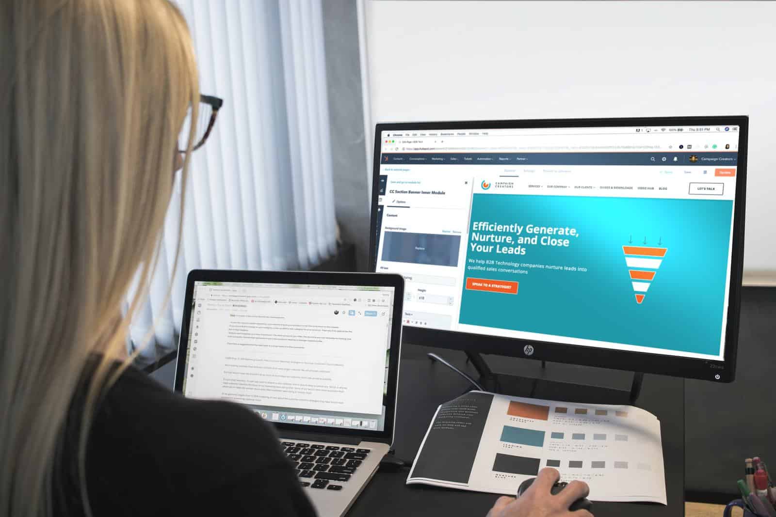
If you are a business owner wondering how you can get your website working for you more effectively, so that you can connect with more customers, then it might be time to sit down with a web designer and do a review.
You’ve had your #WebDesign for a while? Here are 6 reasons why you should revisit it!
We took some time to speak with an Australia-based marketing agency, Dilate Digital who offer WordPress Web Design in Perth to gain some insight into what they look at when working with clients.
1. Is your website platform relevant to your customer offerings and budget

Consider the website platform that you are using, current costs. It might help you determine whether you need to migrate from one such as Wix over to WordPress to meet growing needs and the changing economy.
WordPress is highly customizable for many different industries and offerings and can help you manage your budget compared to platforms that may be focused more on services or products.
App subscriptions and fluctuating exchange rates in US dollars each month can see your Australian based website experience a budget blow out before you even get to brand elements. A migration to a platform might be a good cost management solution.
2. Is your web design relevant to existing and emerging customer markets
If you have been through a strategic marketing review to look at how your customer targets are changing and evolving, you will want to ensure that your website platform and WordPress design is reflective of those changes.
You may have unearthed new markets or new offerings for existing clients, and want to look at how that plays out in your web design.
This is about ensuring that brand elements are speaking to the right customer and conveying the right message. Think about how font, imagery, color choice, content, and customer testimonials are connecting with your ideal clients.

Review these elements to ensure that landing pages, blogs, and social proof – like testimonials, case studies or project galleries are all creating confidence for your customer when they visit your site.
Check your brand elements in your web design to ensure that your brand personality and value proposition are aligned and present digitally.
Keep any problems you solve for customers segmented in a logical sense, and look at how that flows. This is about ensuring that marketing elements “speak” visually and are “heard” by your customers – enough for them to stick around and take the next step.
3. Does your menu & site navigation follow best practices

Balance your creativity with best practice. This is about ensuring that you consider user experience and what good standards are. For example, the hamburger icon signals a menu and is a design element that we are all familiar with. Changing your menu icon to something like three squiggly lines will confuse most people. WordPress developers in Perth can help you to achieve this goals and make the UX awesome and by the standards.
Think about what is helpful for customers – if you had a brand new prospect landing on your website, would everything make sense to them.
When you are using icons, buttons, scroll bars, search bars, and clickable links, does their destination make sense. Navigation needs to be predictable for your customers to help them on their journey, otherwise, the experience can be like using an out of date sat-nav system in your car – you can land on a dead-end and feel frustrated.
If frustration happens, prospects can easily bounce – and bounce rate is measured by Google – so good navigation is valuable.
Think through the structure of menus, sidebars, headers and footers, and what core information your customers will look for. This can include using clear and easy to understand terminology like “contact us” and ensuring it is in your main menu in the header of your site.
Likewise, if you have an e-commerce offering, make it easy for them to review their cart, or add more items to their cart, as best practice sees cart icons in the top right of a website’s page.
For any buttons and hyperlinks, keep colors and fonts consistent and make it easy for your prospects. Clarity is important, which brings us to the next area.
4. Are calls to actions clear
Call to action clarity is a combination of good copywriting and good color and design. Always consider what you are wanting them to do with the content on your website.
This will largely depend on your customer acquisition process, and how this aligns with any interfacing software such as a CRM system/systems for sharing news and updates, account creation, or book appointments.
Basic call to actions include having a contact form on a contact page, or ensuring that you have a Google Maps link to help customers find you if you have a physical address where you want clients to meet you.

If you are wanting to generate leads, think about the content that you are creating (whether it is on your services page or blogs), and consider what is there from a visual standpoint to help convey the value you provide to your clients. Is the first step for them to download a free guide, take a quiz and discover some potential solutions to problems, or book a discovery call with someone on your team.
Whatever your call to actions are, make sure that they are aligned with how you want to do business.
5. What is the scannability of your site like
You can have the best content in the world, however, if it is cluttered content, it is going to be really hard on the eyes of your consumer.
Design elements can help make it easy on the eyes (literally) for anyone landing on your website pages.
Consider the following:
- Headline usage When you scan them, do they help to paint a picture of your value proposition?
- White space around imagery Less is more is a good rule for website design also. Don’t cram too much on one page.
- Are font pairings and colors easy to read and understand? Serif fonts are actually easier to read, and our brain can process them quicker compared to sans-serif fonts.
Not all web browsers support all fonts. If you are considering a custom font, check in with your web designer on what this will look like across different search engines and different mobile devices.
With colors, some work better together than others. Scannability also takes into consideration accessibility for individuals who are visually impaired. Check on your ideal customer, and how inclusive your design is.
6. Is the content meeting quality standards for search engines and customers

Now that your visual framework has been reviewed, look at the quality of the content. Your web designer is about the framework and the flow. How you harness their design, or who is going to help put their web design on supercharge is the next step.
The goal is to cut through the noise online with good design and to keep cutting through so your customers (existing and prospective) do a few things.
- Stay engaged and come back
- Start recommending and sharing your content
This is about developing a discipline to keep sharing fresh ideas that are searchable, relevant, and in line with your brand’s promise.
Think about your blogs, and how you are sharing content.
- How you are making the most of your online images (image size impacts website speed)
- How SEO will start to play a role and make your web design shine
- How you are going to drive traffic to your website, and get that customer conversion happening
What’s next in your website design review
You may want to implement website design updates by yourself or work with a team to make the most of your website design investment. If you think this process might be too big for you to handle, there is always an option to go for a reliable web design company that would help with all the steps. If you would like to explore how a fresh website design can set your business up to evolve in this ever-changing environment, check-in with Dilate to see how they could possibly help you out.