Considering that you are reading this post, you are probably researching what you should know for your upcoming logo. You also probably understand how significant the logo is for any business, so this is a great move. Unlike many others, that are just writing down their business name in a fancy font as the final result, you need to know and do more when it comes to your logo. One way to ensure that you create a unique and effective logo is to consider hiring professional logo design companies, who have the skills and experience necessary to create a logo that truly represents your business and sets it apart from the competition.
Your logo must be as unique and as meaningful as you can make it. Those two things are the most important aspects of your logo.
It needs to convey the right message to your visitors. Namely, they should be able to get what you can do for them, and how you can help them improve their everyday lives.
Think of Google, or Twitter. You are probably remembering the bright-colored letters or a white bird on a blue background. That is the power of a good logo, and it can be same for yours, too. As with these two examples – you don’t need anything fancy, you need something that is unique and easy to remember so that it can get the same recognition in a couple of years through some effective marketing. Its importance is obvious and many professionals resort to logo design companies to guide them in gaining online recognition.
Creating, and after all, choosing the perfect logo is not going to be easy, so don’t get overly excited. “Just make it unique and memorable” sounds like a piece of effective advice, until you get started with it. You will hate the first draft, probably the second one, too. The design you get from someone else is going to be “hideous”.
The most important thing here is not to worry. You’ll get there. And here are some quick tips on how to create a Logo that will bring you great results. These should help you get started.
Create Your Logo – Tips and Tricks
1. Get as precise as possible
Take your time to consider the message that you would like to convey. What is in the core of your business? Do you strive for stability, or is your business more flowy and artistic? Answering these questions will get you some basic insight into what you need your logo to represent.
From there, you might look up to the big guys.
Find successful logos in your niche. Take a long, hard look at them. What colors and shapes are they using? This will give you some basic ideas on what you would need for your logo.
2. The Double Entendre Style
The Double Entendre Logo is a mouthful but is actually the most common type of logo out there. Also known as a combined logo, it includes two designs – both the fancy font and the graphic. These can rarely fail, as they don’t leave as much room for misinterpretation as other, either/or types of logo.
It is also rather convenient to have this kind of logo when starting out. You want your name to be remembered, too. By presenting them both within your logo, you leave more for your future customers to remember. It is also useful when it comes to marketing, as you can further select both or just one aspect for your printed materials.
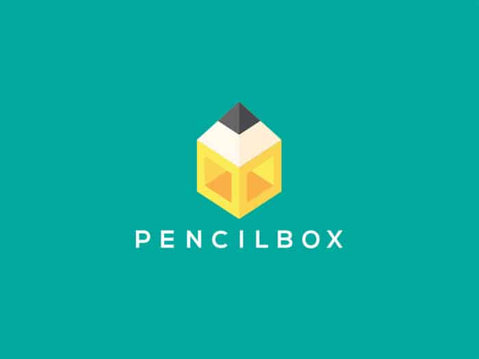
Check out the logo in the image below. It does full justice to the brand by combining both things, visual representation of both pencil and a box, while still having the name spelled out.
3. Colors Are Important
Every color has a different effect on a human psyche, so you should pay close attention to your use of colors in your logo. Colors are not only for making it “pretty”, but they are also conveying a message about your business on a deeper level.
For example, the color of green represents vitality, growth, health, etc, so it is usually the best pick for grocery stores, restaurants, and any food-related business. Would you eat something that looks too black? No? Yeah, then probably picking a black logo for your food business is not going to evoke the feeling you need it to.

4. Know Your Typography
Just like colors, the next thing to pay close attention to is the font. Why? Because your choice of letters does the same as your choice of colors – it conveys a message on a deeper level.
For example, big block letters represent stability, sturdiness, and trust. No wonder that many banks rely on this kind of typography, as they are, in essence, subtly convincing you that your money is safe with them. If you compare such a logo to the one of Disney, which takes you into a fairyland with its cursive font, it is easy to see how the right font can convey a message.
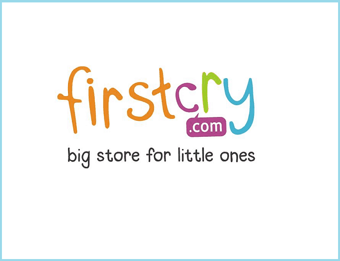
It should also be easy to understand, mind you. For example, just by taking one look at the image below, you know that the brand has something to do with kids. That’s the power of right typography.
5. Consider The Symmetry
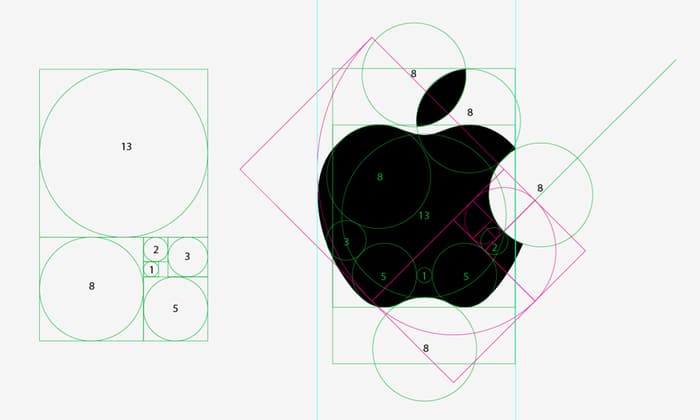
We’ve only named two so far, but you can tell already: a good logo is a combination of a lot of factors. Symmetry and proportion of the design shouldn’t be neglected either. After all, your logo should be visually appealing, and must not give away anything that is “off”. A good symmetry in a logo will have customers feel you know what you are doing.
6. Shrink And Expand
“Can you make my logo bigger?”. While designers and developers hate this sentence, it actually bears a lot of truth. The logo should look good as good on a matchbox, as it would on a billboard. You don’t want it all blurry when shrunk, or distorted when expanded. It needs to look good wherever your customers can see it.
Current Design Trends
Still scratching your head on the best logo? Here are some current trends that you can take advantage of to get the idea for creating the one for your business.
1. Overlapping
Overlapping is the thing you see nowadays everywhere, and for a good reason. PayPal is the perfect example of an “overlapping logo”. It looks nice, first of all, but it also adds depth to the design. Still, the key to good overlapping is not to overdo it. You should keep in mind that simplicity is what you should strive for, in the end. Can you think of any super-complex logo right off the bat? Our point exactly.
2. Trick the Eye
Visual trickery can be a good thing to use in your logo, provided that, once again, it conveys your message properly. It will have your customers think “Oh, I get it now, cool!”, and it will help you become more memorable.
According to Shelby Jorday, it is a cool way to disrupt what is considered acceptable in logo designs. If your business is a bit edgy, and you target people that like to color outside the lines, then go for this kind of design.
3. Minimal
As said before, simplicity is usually the key to a memorable logo. However, it is not as simple to get a minimalistic logo, as you don’t have a lot to work with. Conveying your message while being so limited can prove tricky, but it is not unreasonable to assume that once you get it right, it will perform much better than one-too-many-things kind of logo.
4. New Age Geometry

Speaking of minimalism, the good route to go is by using geometric art as a part of your logo. Geometric design has been the part of architecture and monuments for a very long time now, making this kind of design easy to remember. It can also be a perfect way to depict the precision and attention to detail of your company as well!
No Designing Skills? Use a Logo Creator
Using a logo creator is probably the quickest and cheapest road to getting a logo. By quickest, we mean that you don’t need to dedicate hours to learning about design and mastering Photoshop. Cheapest stands for the offers you will get from designers applying to create you a logo. Try not to faint when you see the prices!
So, here are three free logo creators to get you set up.
1. Free Logo Maker
The free logo maker site can get you a logo in seconds, and you don’t actually have to design anything yourself if you don’t want to. All you need to do is to type your business name on the site. You should also write down the tagline and hit the next button.
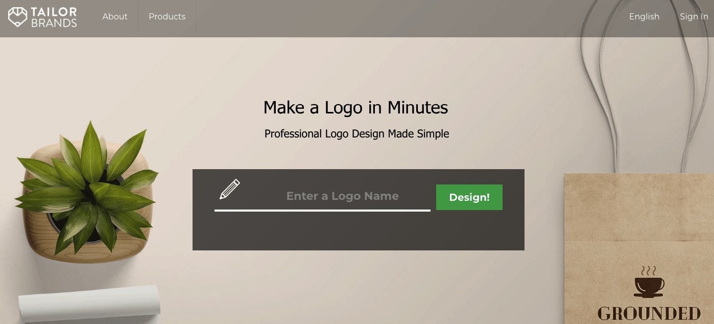
As a next step, you can give a little more information about your business, to get the most accurate logo. Write down things like the niche your business is in, and about your work. The site will do the rest: it will ask you to choose the logotype and offer you options to choose from. Your work is done, all you have to do now is use it wherever you need it.
2. Logojoy
Logojoy is another site that you might want to check out.
The process is similar here to what we described for the first one: You will be asked your business type, logo style, color scheme, symbols, and anything you’d prefer in your logo. The site takes it from there and presents you with several options to choose from.
3. Free Logo Design
Free Logo Design is another similar website that will create the logos and offer you multiple logo options to choose from. Again, of course, based on the information that you provide the site with.

So, how do I get the logo?
Apart from these logo builders, you can also rely on a good designer to take care of your logo. Or, you can dive in, read up, and attempt a DIY solution. Whatever you decide, keep in mind: Your logo says a thousand words about your business. So do not rush to create it just for the sake of having one, but take your time and create one that will represent your business in the best way possible.